|
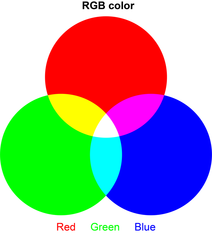
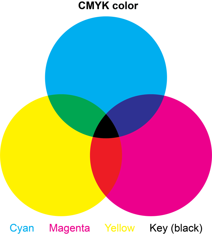
In graphic design, color is one of the most important considerations. For scientific figures, color is an important part of the data visualization to provide aid in visual clarity and effective delivery of the presented data. Also, the right use of color might be important depending on a certain data type in the paper. While the aesthetic quality of scientific figures is not a primary focus of scientific research and paper, figures with poorly selected colors can substantially harm the reader’s experience and clarity of the presented data. In this tip post, I wish to cover the basics of color in graphic design and provide several tips and resources for further in-depth learning on the use of color for data visualization. RGB vs. CMYK In graphic design, there are two major color models: RGB and CMYK models. RGB stands for Red, Green, and Blue and it is majorly used for screen-based (or web-based) images. The RGB model is an additive color model based on the mixing of visual light (meaning the color becomes brighter with more mixing). Since the RGB model is based on the color space for visual light, digital images from measurement devices (e.g., camera, microscope, scanner) are also generated in the RGB color mode as the image sensor reads the intensity of red, green, and blue signals from the input. CMYK stands for Cyan, Magenta, Yellow, and Key (black) and it is majorly used for printed images. CMYK model is a subtractive color model based on the painting of color (meaning the color becomes darker with more mixing). Since the CMYK model is based on printed/painted colors, it is the standard color model for printing-based publication including academic journals and magazines (except online-only journals). While it is not common to distinguish RGB and CMYK color models in scientific research and figure preparation, it is often an important consideration for a certain type of image data. For example, a fluorescent microscope takes all original images in the RGB color models. However, because of the difference in RGB and CMYK color spaces, the same image becomes slightly different in color when it is being saved in the CMYK color model (which is the standard for most printed paper figures) as shown in the above image (confocal microscope images of rat tissue with green and blue fluorescent channels). Hence, it would need the care to keep the original color model for image data in analysis and use the consistent color model in figures to avoid visual confusion and/or misrepresentation of data. Tip 1 – Use resources for in-depth learning The use of color in data visualization is a very important technique in various research fields where the graphical representation of a large amount of data is required. Given the depth of the topic, I wish to introduce several very useful resources instead of diving too much in this tip post:
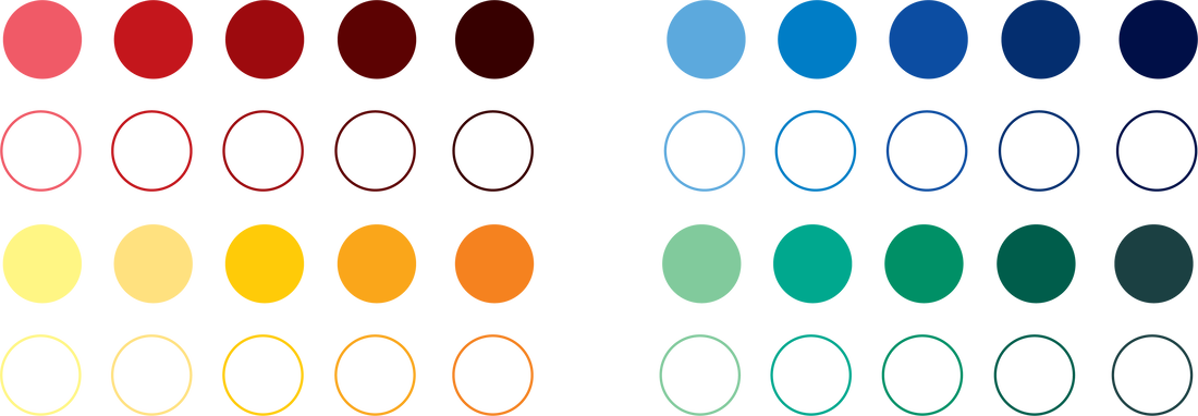
Tip 2 – Make a color code for each paper Inconsistent use of colors in figures is one of the most common sources of bad data visualization and reader experience. Hence, it is very useful to build a color code for each paper before preparing figures based on which you can ensure consistent use of colors in all figures in the paper. There is no strict rule for color codes but there are several points to consider. I also provide various example color codes with a downloadable Illustrator file below.
Various color codes (AI file) As a more practical example, I provide the color code (with a downloadable Illustrator file) that I used for this paper. Example color code (AI file) Tip 3 – Use color wisely Colors in scientific figures can be very effective tools to aid understanding and delivery of information to the readers. For example, different colors can be used to highlight an important step or part in your experiment/data as shown in the below examples. With right and smart use, colors can be one of the most effective tools in our scientific communications. Example 1 – Highlights in chemical schemes Example 2 – Highlights in bar graphs Tip 4 – Be mindful of color-vision deficiency & color-blindness
The main purpose of scientific figures and colors in them is to aid communications of our scientific findings. Hence, it is important to be mindful of the inclusive use of colors for our colleagues with color-vision deficiency and color-blindness. Thankfully, this topic has been well studied with scientifically derived guidelines and suggestions to learn such as this paper (this is a must-read article!). Disclaimer. The contents are my personal opinion and do not represent the view of any institution or company I am affiliated/employed. If you find any incorrect information, please feel free to let me know via my email.
1 Comment
Zhuorui Zhang
3/29/2022 10:14:51 am
Hi Hyunwoo, Thank you so much for sharing this very informative blog on scietific graph design! It is truly helpful to graduate students like me. Just would like to ask a detailed question regarding this. I'm kind of struggling in unifying the font size and the boarders of data plots from different software like MATLAB or matplotlib in python. I usually need to relabel all the numbers and annotations in Adobe Illustrator which is kind of tedious. Could you maybe share a bit of your experience on how to deal with this when you put the data plots together in a figure? Your guidance is very much appreciated.
Reply
Your comment will be posted after it is approved.
Leave a Reply. |
Archives
December 2023
Categories |


 RSS Feed